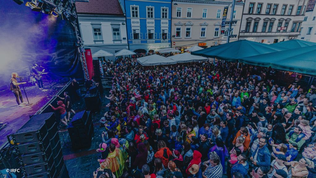
Austria stays at home
We live in unusual times. It is unusual to be restricted in one’s movement. Unusual to wear protective masks. Unusual to live in a state of crisis and worry.

It was also unusual for us to suddenly find ourselves at the centre of media attention after our decision to support the Austrian government in its fight against COVID-19. We were confronted with an uneasiness. An uneasiness triggered by the word “movement analyses”, reinforced by the “to the Austrian federal government” following in the same sentence.
Yes, we provide motion analyses to the Austrian federal government. We do this because we are good at it. Because we believe we can help with it. We do it the way we do it for all our customers: anonymized, on a community level without traceability to individuals, in accordance with strict data protection regulations and with a TÜV-certified anonymization process by our partner A1. But it’s no longer enough for us to just say it. We also want to show it.
That’s why, in these unusual times, we’re taking another unusual step for us and making our analysis results publicly available.
We approached the federal government’s crisis team with a simple consideration in mind: Human mobility plays a central role in both the spread and control of the COVID-19 virus. We are experts in mobility analysis. Not only that, but we may be able to help.
Specifically, this involves the theory of social distancing: the fewer social contacts I have, the flatter the curve of contagion. The flatter the curve, the lower the risk of overburdening the health care system. So far, so often heard. Building on this idea is the assumption that as mobility decreases, social distancing increases: The fewer social contacts the average person has, the more limited his or her range of motion.
In order to make this decreasing mobility, and thus subsequently the effects of the measures adopted, comprehensible and measurable, we defined the indicator of the “mobility rate”.
Mobility: radius of movement over one kilometre in the course of a day.
Mobility rate: Proportion of anonymized cell phones with mobility per municipality.
Conversely, this also results in the rate of those who are not mobile or only slightly mobile in the course of a day. Those who stay at home.
Stay-at-home: proportion of anonymized mobile phones with a movement radius of less than one kilometre
However, the mobility rate indicator alone does not provide any information about the effects of the measures adopted. These only become visible by comparing the current mobility rates with the mobility rates for one day before the measures came into force. It is this change in mobility per municipality that we have been calculating for the Austrian crisis team since mid-March and making available to the public as of today. A figure per municipality that provides information on whether the measures are being followed. Whether social contacts are being reduced. Whether the curve has a chance of flattening.
The answer? Yes, they are taking effect. Mobility and therefore social contacts are reduced. We see an average drop in mobility of 30%, in urban centres even more than 40%. In short: Austria stays at home!
Interpretation of the results
- The decline in mobility in cities is above average. This is primarily due to the availability of the necessary infrastructure in the immediate vicinity. Due to labour policy measures (home office, short-time work, etc.), commuting to work is no longer the main reason for inner-city mobility.
- Conversely, this explains the somewhat weaker decline in rural areas. First, the share of longer trips, over 1 km, is already higher on normal days before the legal measures than in other municipalities. Thus, even during the statutory measures, there is naturally less mobility reduction. Second, the community population has to travel longer distances to reach system-critical infrastructures (doctor, pharmacy or grocer) or the workplace.
These results make us feel positive. The measures are taking effect. Mobility is declining. The green map is a sign for us. A sign that Austria is sticking together. That everyone is doing their part. That we will master these unusual times together.
Stay healthy. #stayathome